THE FRONT COVER- STAGES IT WENT THROUGH
Some of these magazine try-outs had the previous model's name on and are drafts.


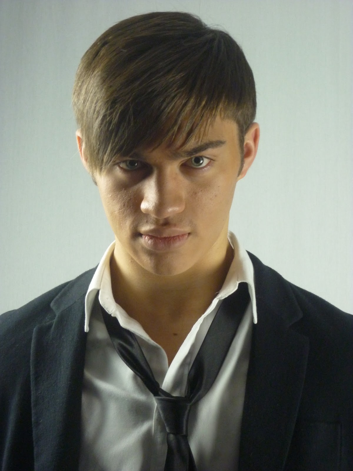
PICTURES- THE FRONT COVER
Throughout the many weeks i have been designing and creating my magazine MFG i have found it very difficult to take pictures suitable to to fit with my aim and the style i wanted it to be. I found that the model i used for the magazine cover and article was hindering the style of music it was supposed to be and did not give the incliniation of it being a fashion magazine. Therefore, i had to model myself due to knowing how to portray this model side of the magazine clearly and without question. I looked at existing pictures within magazines such as FHM and looked at how i could do it with style and elegance. Shown here is the new picture i have chosen along with 2 others i could have chose, along with the old picture of the model:
 |
Old picture- The problem with this picture was that it was breaking the convention by not looking at the reader therefore causing the problem of maybe less sales and not looking like a music magazine. |
 |
| New picture- This picture was chosen because of its quality and eye focus. It showed the reader what kind of magazine it is and capturing a professional mature look out into the woprld of music- illustrating to the audience that this is a magazine with style and class. |
 |
| The reason why i did not choose this picture was because i wanted more of a side view of his head so the subheadings and topics on the magazine front cover would be clearly illustrated without any obstruction i also felt the lighting did not fully suit with the front cover as i wanted a slight shadow on the left side of the head and this is done in the middle showing that there is no mystery behind the music king "MCBRIDE". Therefore, not entising the reader to buy the magazine. |
 |
| This picture was the same as the last except a medium closeup and i didnt feel that a medium close-up was suited to my front cover as i wanted a front cover with intensity and i feel that the close up of my peering out into the audience did that and this is to model-like not illustrating the music background behind it. |
No comments:
Post a Comment