<div style="width:477px" id="__ss_7832802"> <strong style="display:block;margin:12px 0 4px"><a href="http://www.slideshare.net/smcmediastudies/morgan-mcbrides-print-project-evaluation" title="Morgan McBride's Print Project Evaluation">Morgan McBride's Print Project Evaluation</a></strong> <iframe src="http://www.slideshare.net/slideshow/embed_code/7832802" width="477" height="510" frameborder="0" marginwidth="0" marginheight="0" scrolling="no"></iframe> <div style="padding:5px 0 12px"> View more <a href="http://www.slideshare.net/%22%3Edocuments%3C/a> from <a href="http://www.slideshare.net/smcmediastudies%22%3Esmcmediastudies%3C/a> </div> </div>
THIS POWERPOINT DUE TO THE WEBSITE HAS HAD SOME OF THE CUSTOM ANIMATION AND BUTTONS DISABLED
Wednesday, May 4, 2011
Tuesday, March 22, 2011
Audience feedback questionnaire for the magazine
Below are the results of the questionnaire i give out to 10 people about my magazine displayed in pie charts.
Question one.
What does the title suggest to you?
 The most popular result was as i hoped. A magazine name with simplicity and a fashionable edge. I feel that the simple subheadings on the front cover helped and the easy three letter name MFG gave the magazine a simple yet stylish edge. Moreover, due to their being a full stop between each meaning for each word of the magazine name ( MUSIC.FASHION.GOSSIP) it provided the reader with a simple memorable understanding of the magazine and its name. I am glad that the answer "fashionable" came up because i really wanted my magazine name to give off the theme of fashion.
Question two.
what genre/type of music does the magazine focus on and how do you know this?
 I am pleased with this result as even though my magazine focuses on R&B and Pop it has an arrange of music in my magazine. The reason for this is due to some artists even though a different genre of music contain songs that have a modern or upbeat twist, remixes for instance can vary from very old folk songs to 80's pop ballads.
Question three.
What makes the pages look professional and what stops them from looking professional?
What makes them look professional-
 The finish of my magazine was something i focused on deeply. I looked at inspiration for my magazines off fashion websites and other existing music magazines and i eventually mixed everything together in order to create a good layout. The photos i am particularly pleased about as all poses were original and modeled on pre-existing models and musicians that have done photo-shoots in magazines like FHM (the only difference is this was done with fashionable clothing that are currently 'in'.)
what stops it from looking professional-
When giving out the questionnaire the responses i got back were either blank or no idea. I asked people verbally and they said possible the high level of modeling however, i explained to them the idea behind the magazine and after looking at what the magazine stood for they retreated their comments.
Question four.
How genuine does the front cover seem?


Question one.
What does the title suggest to you?

Question two.
what genre/type of music does the magazine focus on and how do you know this?

Question three.
What makes the pages look professional and what stops them from looking professional?
What makes them look professional-

what stops it from looking professional-
When giving out the questionnaire the responses i got back were either blank or no idea. I asked people verbally and they said possible the high level of modeling however, i explained to them the idea behind the magazine and after looking at what the magazine stood for they retreated their comments.
Question four.
How genuine does the front cover seem?

I am extremely pleased with this result especially after redoing the front cover many times due to not being happy with the advertisement techniques or layout.
Question five.
Does the contents page simply inform or does it also manage to interest you in reading the rest of the magazine?

this is another result i am pleased with as i looked at other magazines and after asking people about why they buy magazines they said because of the people inside. Therefore, i used big artists such as Katy Perry etc.
Question six.
Does the article sound like a piece of journalism?

I am moderately pleased with this result, the no was further expanded to say that it seemed too "complicated word wise" however the other people commented on the language used in the article and said it brought a professional edge to the magazine.
Question seven.
Does the articles layout make you want to read it? if not why not?

After looking at these results i am extremely pleased with my magazine. The no was once again by the same person therefore i will have to count it as an error as the other people who took part stated how it made the article seem more stylish.
I am very pleased with all my results, i feel i have achieved the audience intention and I feel that if this were a magazine to be published this could have the possibility to succeed.


Reflective Production Diary- finished article
Changes continued

New article layout-

The article is much more professional in its layout and structure. i have kept the black background because it has allowed the text and pictures to stand out and is a good color as it is neutral. it also contrasts with the white. I have overlapped the pictures which are posed in three entirely different ways and subheadings are used to allow the reader to familiarize themselves with the artist.
Old article layout-

The article has hugely improved from this. Some grammatical errors have been corrected from this and a centre fold has been placed within my article now. Although, i liked the layout i feel that it did not match with a music magazine convention. Moreover, if this was done as a proper magazine article, text and images would be missed out due to there being no gap within the two A4 pages. Furthermore, even though i liked to integrate the color purple in the article i feel that it brought the audience eye on the images more than the full article. Additionally, when the layout of the text is totally unconventional There is no heading to show that this is an article, the text starts to far up and the 'Q&A' part has big gaps throughout.
Old article layout-

Monday, March 21, 2011
Reflective Production Diary
Changes/Challenges


After the problem about the model i had to change my article, contents page and front cover and change the layout slightly.
The front cover before and after(featuring me and the previous model)


The new front cover
The new front cover contains less information about the things featured within the magazine as i didn't want to flood the audience with articles and new artists. I added some of the things seen below in a footer underneath the barcode and picture in order to provide the reader with extra information and mirror the top of the cover therefore creating a stylish mirroring affect and keeping the front cover tidy and organized in its layout.
The old front cover
The old front cover had to many subjects on its front cover and the description of the things on the front cover was too long. The dull font was not attractive and could not be seen from a great distance therefore in my new front cover the headings are purple and down to attract the audience to the subjects on the magazine. I also felt that the things made to sell the magazine to the audience, the "5 posters", did not fit with the magazine type and was placed very daftly due to it blocking out the models face.
Changes in the outfit
When editing my front cover i did more browsing about fashionable clothes and i noticed a change. After looking at more designer clothing and aims for the summer i have noticed that stripes are just a limited fashion time period and normal plain slim line suits are the new thing. Therefore, i used the black slimline designer suit i had with my white italian handmade shirt in order to display the elegance of the magazine and the fashion world.
Changes in the article design
The article with Ryan as the model had a totally different design to the one with me in. After spending many hours looking at the design layout and changing it due to not being sure whether it fits the criteria of the magazine i decided to change it and change the background of the model.
The new article design- the new article design has no massive lines seperating each individual picture. However, does not go with the folding of the page therefore, i will need to re-do the layout

The old article design-
the plain white background did not do the magazine justice and dynamism and lacked style. I also felt that the model poses did not show the reader clearly the music of the magazine and the intention of the pictures.
The contents
The contents have gone along way from the basic structure. I have pictures illustratring the things in the magazine clearly and it a perfect selection has been used with photoshop editing creating a nice smooth and finished affect for the contents.
 The contents page has hugely improved from the last one. It has pictures that draws the readers in and gains their attention due to there being photos of existing artists that are constantly in the charts, it also provided the magazine with simplicity which is what i want the MFG to have, simplicity with its hugely thought of design.
Changes in the outfit
When editing my front cover i did more browsing about fashionable clothes and i noticed a change. After looking at more designer clothing and aims for the summer i have noticed that stripes are just a limited fashion time period and normal plain slim line suits are the new thing. Therefore, i used the black slimline designer suit i had with my white italian handmade shirt in order to display the elegance of the magazine and the fashion world.
Changes in the article design
The article with Ryan as the model had a totally different design to the one with me in. After spending many hours looking at the design layout and changing it due to not being sure whether it fits the criteria of the magazine i decided to change it and change the background of the model.

The old article design-
the plain white background did not do the magazine justice and dynamism and lacked style. I also felt that the model poses did not show the reader clearly the music of the magazine and the intention of the pictures.
The contents
The contents have gone along way from the basic structure. I have pictures illustratring the things in the magazine clearly and it a perfect selection has been used with photoshop editing creating a nice smooth and finished affect for the contents.
 The contents page has hugely improved from the last one. It has pictures that draws the readers in and gains their attention due to there being photos of existing artists that are constantly in the charts, it also provided the magazine with simplicity which is what i want the MFG to have, simplicity with its hugely thought of design.
Reflective Production Diary
THE FRONT COVER- STAGES IT WENT THROUGH
Some of these magazine try-outs had the previous model's name on and are drafts.


PICTURES- THE FRONT COVER
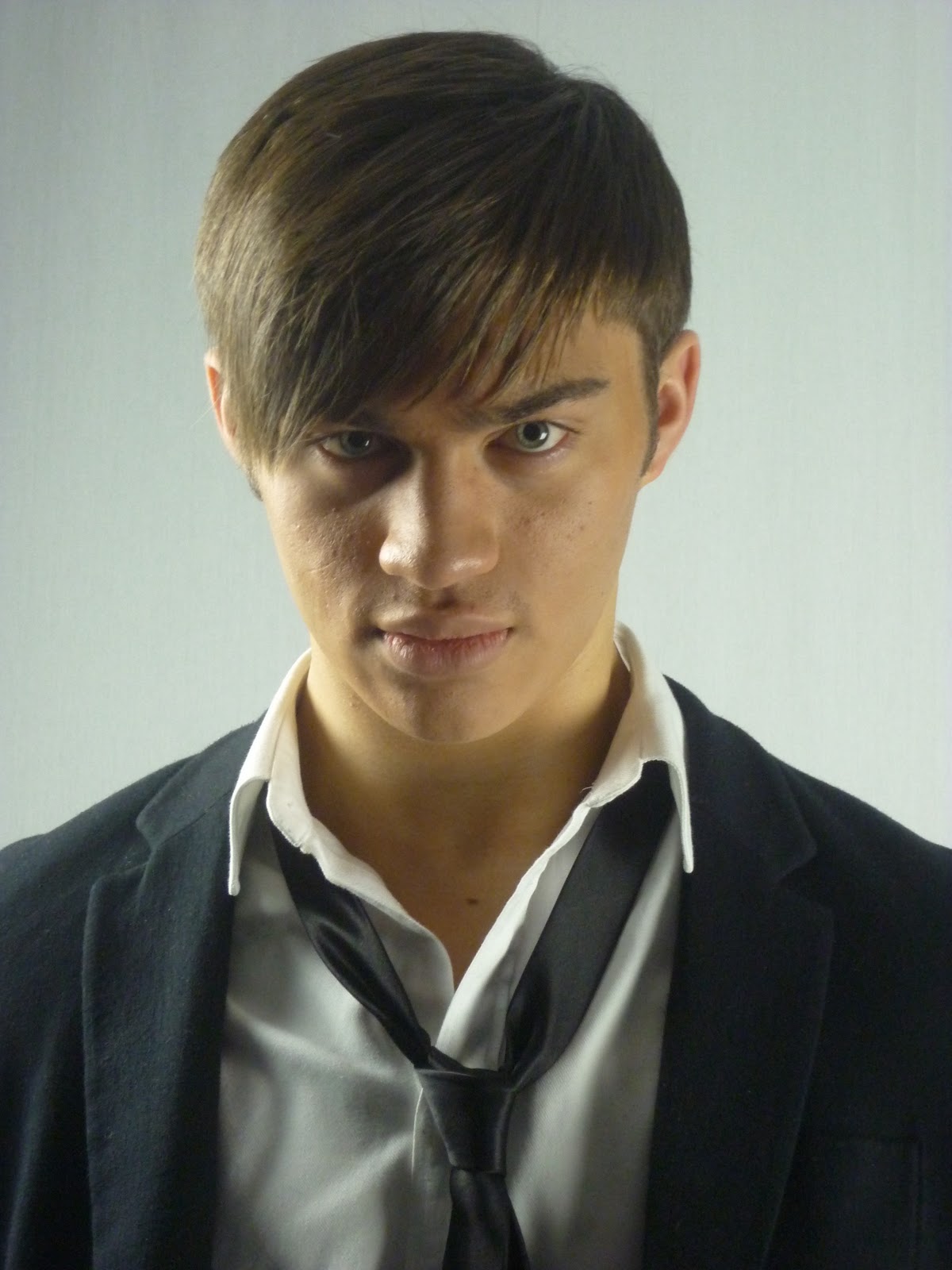
Throughout the many weeks i have been designing and creating my magazine MFG i have found it very difficult to take pictures suitable to to fit with my aim and the style i wanted it to be. I found that the model i used for the magazine cover and article was hindering the style of music it was supposed to be and did not give the incliniation of it being a fashion magazine. Therefore, i had to model myself due to knowing how to portray this model side of the magazine clearly and without question. I looked at existing pictures within magazines such as FHM and looked at how i could do it with style and elegance. Shown here is the new picture i have chosen along with 2 others i could have chose, along with the old picture of the model:
 |
Old picture- The problem with this picture was that it was breaking the convention by not looking at the reader therefore causing the problem of maybe less sales and not looking like a music magazine. |
 |
| New picture- This picture was chosen because of its quality and eye focus. It showed the reader what kind of magazine it is and capturing a professional mature look out into the woprld of music- illustrating to the audience that this is a magazine with style and class. |
 |
| The reason why i did not choose this picture was because i wanted more of a side view of his head so the subheadings and topics on the magazine front cover would be clearly illustrated without any obstruction i also felt the lighting did not fully suit with the front cover as i wanted a slight shadow on the left side of the head and this is done in the middle showing that there is no mystery behind the music king "MCBRIDE". Therefore, not entising the reader to buy the magazine. |
 |
| This picture was the same as the last except a medium closeup and i didnt feel that a medium close-up was suited to my front cover as i wanted a front cover with intensity and i feel that the close up of my peering out into the audience did that and this is to model-like not illustrating the music background behind it. |
Tuesday, February 15, 2011

Monday, February 14, 2011
reader facebook profile
Friday, February 11, 2011
IDEAS FOR CONTENTS PAGE

Wednesday, February 9, 2011
ideas for the front cover
ive had many ideas for the front cover and i have listed them out using existing celebrities as examples


- Have a close up of Mark ronson and and a long shot

2. Have several long shots of mark ronson on the front cover and this could highlight what they do in song
(e.g. have his voice repeated throughout the track allowing the fans to think there is more than one person singing. I might use this example in my magazine to appeal to a high range of Pop genre fans.

3. After doing an example of my front cover i have really decided to focus on the idea of three shots of the same person. I was thinking of either him looking at the left, looking at the right and then looking straight forward to the camera and arranging it so its three different profiles. Or i could either do several shots of him to look like hes moving. This is a basic version.

Feedback 9.2.11
Well done Morgan. You have caught up well here and are makingexcellent progress. Keep this up.
Mrs A
Mrs A
Tuesday, February 8, 2011
My calendar
Week Activity/Target
6/02/11- I will complete my planning and book all my equipment and location i need to do a successful
shoot.
13/02/11- Finish my practical tasks and look at my production tasks such as photos, articles etc.
Half term-try and complete any missing work or try and locate any errors in the existing pieces.
28/02/11- continue on with my tasks such as the contents etc.
13/03/11- Complete the practical work
Planning Photo shoot
My main idea is to have a man for the first issue of MFG highlighting that the magazine is for men. it will cover a two page article on the up and coming star who has recently sang with the likes of katy perry, Rihanna, and is now touring in the UK for 9 months or so.
The man and his props
The man will be Ryan townsend. I am talking to him about the kind of music he is into and whether he will fit into the genre of music i want the artist to be in on the first issue.
I am not quite sure if i want props on the front page of the magazine- if it covers fashion and gossip it would be quite good to get a medium or long shot of him in a stylish outfit.
Outfits
Outfits are a hard thing to decide on. Depending on the season i want to cover i can dress him in many things. However, the thing i have decided on is a suit.
Suits- Suits are an ever stylish, never changing fashion style that are always seen to be worn by the best of the best. GQ had an online picture blog of who was the stylish men of the week. All of which are wearing suits. The man who was seen as the first picture (presumably the most fashionable man) is Pierce Brosnan seen in his brilliant winter wear.

This brilliant winter wear being a pin striped suit and showing off the suaveness and flare. This is the kind of outfit i would be wanting the man to be in. Moreover, showing the magazines class and style.
pin stripes are an 'in thing'. Many designers now produce fashionable pin-stripe patterns for fashion obsessed consumers.
Moreover, The AUTUMN/WINTER Dolce and Gabbana 2011-12 range for milan is a range of suits both ranging in style and colours. However, most of the suits being in pinstripes.
Furthermore, after doing many hours of research for many designer labels 20111-2012 autumn winter wear it has become apparent that suits will be worn in a more more fashionable manner. Suits of all designs will be worn throughout the world and what better to start the trend off than my magazine?

Thursday, February 3, 2011
My magazine name
I have decided to ask a range of people what name of magazine they most like and would intend to buy. This the options i have given
The results for the magazine name:
- MFG- Music, fashion Gossip for men
- M MAG
- TIS- The industries speciality
The results for the magazine name:

Planning and the equipment/technologies to be used
After completing all my research tasks, i have now go on to my planning for my magazine.
However, in order to properly design and plan my magazine, the layout and my feature article i must identify the equipment and technology i need to use:
Imac- the Imac contains the technology needed to produce my magazine, for example:
-a camera with micro lens enabling full high quality photographs
- a tripod (possibly) in order to help me with a steady shot.
- A white screen
-light enhancers in the studio that allow the light to go on specific areas
However, in order to properly design and plan my magazine, the layout and my feature article i must identify the equipment and technology i need to use:
Imac- the Imac contains the technology needed to produce my magazine, for example:
- In design
- Photoshop
-a camera with micro lens enabling full high quality photographs
- a tripod (possibly) in order to help me with a steady shot.
- A white screen
-light enhancers in the studio that allow the light to go on specific areas
Analyzed band images


one of the main artists that interest my target audience is Katy perry. She is a huge sex symbol that hypnotizes hundreds of men to buy articles like these. Both pictures are taken for very popular magazines.
ESQUIRE MAGAZINE
The one on the left is taken from Esquire magazine, an article that was released in JUNE 29TH, 2010 and the issue was about "pop-chart topping and soon to be Russell Brand-marrying Katy Perry". The issue talked about her in a more informal style as we got to see the real Katy Perry. Risque in parts the article allowed the magazine to have huge sales. She is represented using lingerie, black heels and jewelry attracting men automatically to the magazine. She is seen top naked in order to attract attention and shows the sexy side of women with her curves and covered breasts. this is the kind of thing that a magazine aimed to men would have to show in order to gain sales. The black gives connotations of darkness and therefore slight sexual deviance immediately comes to mind. Jewelry such as the cross also enhances her image to the target audience as she is trying to pull off that "naughty girl" look as if she's going against the church with what she is doing at the moment. The nakedness attracts the magazine to men and the background is a simple grey color allowing it to be neutral. The reason behind this is due to them wanted to attract the target audience towards the risque picture of Katy Perry on the magazine. if thy had gone for a bright color on the background it would have made that more apparent than the actual picture they are trying to pull off for sales. The body language she gives off sis very flirtatious but in an innocent way (things such a her covering up her left breast). Within this picture we see she has quite closed body language and even though she is shown half naked her closed in body language suggests innocence and beauty. Moreover, by doing this in a medium shot it allows the viewers to concentrate at her upper body and want to see more.
FHM
The second picture is of Katy Perry in FHM a few years back. The silk white dress is used in order to attract the men and compliment the background. She is shown as pure and gives connotations of her being angelic which is a great contrast of how she was in the recent picture which has increased her popularity and made her one of the sexiest women. although, her shoes black(with a red sole) shows that she has a naughty streak and therefore allows men to be extremely attracted to her. Her body language gives the same sort of connotations however in a more flirtatious devilish way. She is photographed from the side in a long shot allowing the viewers to look at her whole figure. The font is very modern. She is not classed as "the girl next door'. The writing in black suggests that she has a dark undertone and the little phrase above her name is brilliant. "We photographed a girl. And she liked it" famously reflecting on her very sexual controversial song. The song that got her noticed within the music industry. Moreover, it is in red giving connotations of love and the devil ( naughty girl). the red lipstick also attracts the target audience as it is classed as the sexual color.
Wednesday, February 2, 2011
Project Phoenix, Demographic and Physcographic profiling
GRASS-
Gender- Its primarily aimed at males
Race- No preference, this is for all.
Age- 16-20
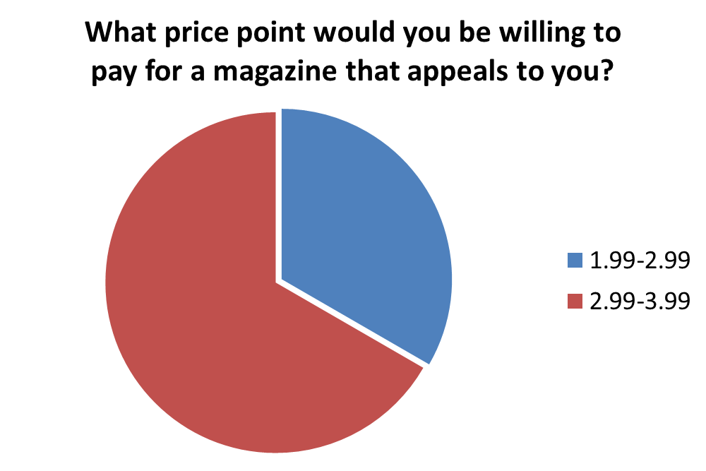
Socio-econmic status- B,C and E (students) will be who it is for mainly as they will have the spare money needed to purchase the magazine. Although, it is seen that students are not bothered about using spare money to buy the magazines as my question was based from 17-19 year olds. Moreover, one of the ansers to a question said that a majority would go for a dearer magazine.
Psychographic Profiling-
I am going to aim the magazine at Mainstreamers and Aspirers, i will explain further. I am going to aim it at mainstreamers because they tend to go for well-known brand names. Therefore, if i was to aim it at them i have to use well- known fashion brands like 'Republic' 'Topman' 'River island' 'H&M' inorder to grasp that kind of market as it is the largest section.
Furthermore, i could also aim it at Aspirers as they go for smart high tech and high fashioned goods. This kind of market would fit perfectly with my USP's as they would love to read and familiarize theirself with my fashionable edge.
Gender- Its primarily aimed at males
Race- No preference, this is for all.
Age- 16-20
Socio-econmic status- B,C and E (students) will be who it is for mainly as they will have the spare money needed to purchase the magazine. Although, it is seen that students are not bothered about using spare money to buy the magazines as my question was based from 17-19 year olds. Moreover, one of the ansers to a question said that a majority would go for a dearer magazine.
Psychographic Profiling-
I am going to aim the magazine at Mainstreamers and Aspirers, i will explain further. I am going to aim it at mainstreamers because they tend to go for well-known brand names. Therefore, if i was to aim it at them i have to use well- known fashion brands like 'Republic' 'Topman' 'River island' 'H&M' inorder to grasp that kind of market as it is the largest section.
Furthermore, i could also aim it at Aspirers as they go for smart high tech and high fashioned goods. This kind of market would fit perfectly with my USP's as they would love to read and familiarize theirself with my fashionable edge.
Analysing the journalistc style and structure of an article


I chose to analyse the style and structure of the article from Q magazine. I felt that due to it being a more popular magazine choice i feel that the style it is written must be more superior and popular with readers. Therefore, this would be a good model for me to look at and study in more detail.
My questionnaire and results

This is the questionnaire i gave out to people in order to find out what i need to do to my magazine and what will attract people to it and here are my results from the many people i asked:


After doing this research i have identified my target audience.
Subscribe to:
Posts (Atom)